Learning spaces – are we doing enough?
With the start of a new academic year swiftly approaching (I realise many have already started, sorry) I am again having discussions with academics on the best way to use the spaces they’re given.
It’s not only about the size or resolution of the screen/projector. It’s not about the fact there is always a spot-light right above the screen which makes it so difficult to see the content. It is about whether the space is too cold or hot. It is about whether there is enough natural light, or is it annoying neon strip lights? Is there (enough) power sockets spread around the space so trailing wires aren’t a trip hazard? Can students get in and out of the room and seats quickly to enable a quick or easy change between classes? What about the spaces outside the classroom – does the next class block the exit as they hover outside waiting to get it?
This is the kind of thing that needs attention when looking at learning spaces, not just about how flexible the seating arrangement is. Yes, it’s good to have flexibility of room layout and the kind of devices that can connect to the infrastructure, but not at the expense of comfort or access. Can they bring a drink with them (most classes and lecture theatres say ‘no food over drink’, yet sessions over lunchtime often mean the students are flagging from lack of energy.
All this has an impact on how the students view these ‘spaces’, how they interact with it, even how they like or dislike it. If you’ve annoyed the student before they’ve even sat down, will you ever re-capture them for the reason they’re there?
So, with Universities committing to new buildings, the question is .. are ‘we’ doing enough to make the spaces fit for learning, or just fit for bums-on-seats?
Here are two of the best learning spaces I’ve seen, either in person or online:
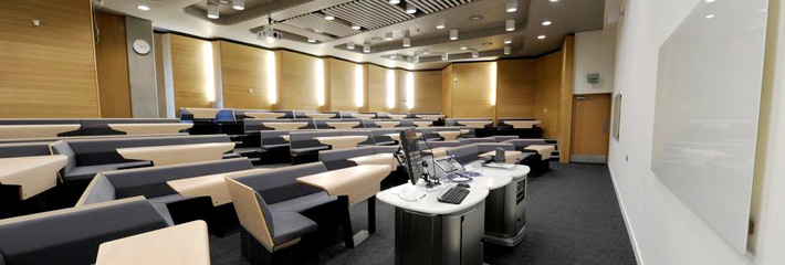
Loughborough University: Lecture theatre – The first meeting of the East Midlands ALT group was here, and we used this space fantastically. A series of presentations and small group work enabled us to collaborate and discuss projects with colleagues on our desk, but also engage and interact with others on similar and surrounding desks. Each table can sit four comfortably, six at a push, getting in and out (for activities and a swift room change) is easy and I even remember power sockets available too (can someone check this for me please?).
The room itself was quite shallow but wide, and perhaps I’d prefer a little less of a ‘stage’, and a more flexible workstation for the presenter/facilitator, but this is one of the few spaces I always talk to people about when the topic of spaces for learning is raised.

University of Birmingham: Collaborative spaces – I’ve seen many of these spaces (University of Dublin, at the 2014 Blackboard Conference – but I didn’t get a photo. Silly me) around but this is the best photo I can find. A slightly tiered floor enables those further back to still see the front/presenter, but every other row of seats can turn round and engage with the row behind. The desks are curved to enable a slightly less formal appeal/structure, and aid getting in and out.

Schools of the future: Stephen Heppell – This video is from 8 years ago (2008) and we’re still talking about these learning spaces. I think (I have no proof) that we have moved on somewhat from this discussion, there are more spaces described by Stephen here, but it does also still feel we are having the same conversations, seeing the same spaces being replicated, and that those who design (and pay for) these spaces are not moving things forward.
Here are some more resources I’ve been saving as I surf, all about learning spaces in all sorts of shapes and sizes:
- 5-Minute Film Festival: Classroom Makeovers to Engage Learners
- Collaborative Learning Spaces: Classrooms That Connect to the World
- Stephen Heppell – Stephen Heppell: Maker Spaces 1 (there are a further 2 videos in this series, both worth watching too)
- 20 Things Educators Need To Know About Learning Spaces
- JISC – Evaluating and designing learning spaces
- Connected and collaborative university spaces
If you know of a learning space, or indeed work in one, that should be shared and shouted about (good or bad), please let us know in the comments below.
Update: How about this great set up Neil Morris and Stewart Ross at the University of Leeds? Fantastic, love it. I would love to hear more about the reasons for the different elements, and also see it being used for teaching and learning .. please?
Visiting our new multi million £ investment in collaborative teaching spaces with digitally enhanced desks. Amazing @NeilMorrisLeeds pic.twitter.com/ppfhacEVUr
— StewRossLeeds (@StewRossLeeds) October 6, 2016
@hopkinsdavid @StewRossLeeds collaborative pods seat 5 with touch screen tablet linked to lectern and projection system pic.twitter.com/t9jzZInXIy
— Neil Morris (@NeilMorrisLeeds) October 7, 2016


The Loughborough Uni room looks very cool, straight off the set of Star Trek. Interesting how space can be used to encourage different forms of interaction and arguably encourage better pedagogies. The Loughborough room reminds me of the work Jim Boyle did at Stratchlyde Uni started 20ish years ago. Jim was interested in the work Mazur was doing with clickers and Peer Instruction which encourages students to work in small groups … so they made the seating work for this https://www.flickr.com/photos/jiscinfonet/396556552/in/photostream/
Conveniently there is a new ALT Learning Spaces SIG being created more news very soon .. stay tuned to #altc #LSsig
Cheers Martin, I look forward to hearing more about the ALT Learning Space SIG, and hopefully getting the architects that seem to always work on university buildings involved too? Whilst some ‘blame’ can be squared on their shoulders for not designing spaces for learning, the rest of the blame is on the committee that accepts and authorises the new buildings.
The architect who worked on the latest extension to the WBS have also worked on loads of other buildings -http://www.associated-architects.co.uk/projects/education/universities/warwick-business-school/ – but seem to have a style, seats, layout, etc. A bit disappointing really. It’s good, don’t get me wrong, but not actually as innovative or ‘unique’ as we might think when viewed individually.
It became so important to think about learning spaces that fit in the new learning age. Here in Brazil I´ve just interviewd a school director which is a great person, a very dedicated professional, and she promoted simple but incredible changes at the school she drives aiming to make the students feel better. Redesigning Learning Spaces is one of the issues covered by the Horizon Report 2016 edition – http://www.nmc.org/publication/nmc-cosn-horizon-report-2016-k-12-edition/ as a mid-term impact trend (Driving Ed Tech adoption in higher education for three to five years)